Figures are one of the most important components in academic papers that convey information in an intuitive and straight-forward manner. Good figures help your audience quickly understand your points and have good impression with your paper.
This series of posts provides several useful tips for creating professional figures. In particular, this post will cover how to draw a figure and incorporate figures into a $\LaTeX$ document.
Use Vector Graphics Whenever Possible
When discussing figures, there are typically two types based on the format of information they store:
- Vector Graphics: Represent images using mathematical equations to define geometric shapes such as lines, curves, and polygons. These graphics are resolution-independent.
- Bitmap (Raster) Images: Represent images as a grid of individual pixels, each with its own color. These graphics are resolution-dependent.
Vector graphics can be scaled to any size without losing resolution, making it well-suited for printed papers.
Typical filename extension for vector graphics are .svg (mainly used on the web),
.eps,
.pdf (best suitable for LaTeX).
LaTeX supports vector graphics by default and we suggest you include graphics images instead of bitmap images whenever possible.
For photos you have no choice but use bitmaps like jpgs or pngs,
but for whatever other charts, diagrams, eta, opt for vector graphics.
The two figures below are of the same content but with different formats (jpg v.s. svg).
If you zoom in you will observe the significant difference.


The SVG image maintains clarity regardless of the zoom level, whereas the JPG image becomes blurry when zoomed in.
If your figure is made by other tools such as Matplotlib, Matlab, PowerPoint, InkScape,
always export or save into vector graphic format such as .pdf, .eps, .svg (pdf is highly recommended).
Never screenshot or export the figure into bitmap images such as .png, .jpg, .bmp.
Tip: A straightforward method to differentiate between bitmap images and vector graphics in a PDF is to select the text elements. If the text is selectable, it is vector graphics.
Unify Fonts Throughout the Paper
Use a uniform font style and font size throughout your paper. At times, you may have text on your figure for illustration purpose. Ensure the font size and font style of in-figure text the same with those of the main document.
Use overpic to put text in figures.
If you intend to include text annotations in a figure created with tools like PowerPoint, avoid directly adding text in PowerPoint. This is because the font style and font size in PowerPoint may not align with those in LaTeX.
Instead, make a plain figure without any text and then add text to the figure within LaTeX using the overpic package (https://ctan.org/pkg/overpic).
For example, if you want to add following diagram into your paper

How would you add the text Module-1, Module-2 and Module-3 to the diagram?
You have two options:
- Make a figure with third-party tools, e.g. PowerPoint, and add text directly inside the tool.
The corresponding LaTeX code for such a figure is
\begin{figure}[!htb]
 \centering
 \includegraphics{figure-with-text.pdf}
 \caption{
     Figure with text added in PowerPoint.
 }
 \label{fig:example-a}
\end{figure}
The resulting figure in the paper is:

- Make a plain figure without any text and then add text within LaTeX.
The corresponding LaTeX code is:
\begin{figure}[!htb]
 \centering
 \begin{overpic}{figure-without-text.pdf}
     \put(9, 7.5){Module-1}
     \put(42, 7.5){Module-2}
     \put(75, 7.5){Module-3}
 \end{overpic}
 \caption{
     Figure with text added in \LaTeX{} by overpic.
 }
\end{figure}
And here is the result

The \put(x, y){text} command provided by overpic basically puts text onto specified location.
As you may observe, the font of PowerPoint is different from the
font in the main document.
But if we add text within LaTeX using the overpic package, we get consistent font style and font size throughout our document, enhancing the overall professionalism and visual appeal of our paper.
More importantly, we can add any eligible LaTeX elements, e.g. equations, symbols, references, references to equations, figures, tables, to the figure using the \put(){} command.
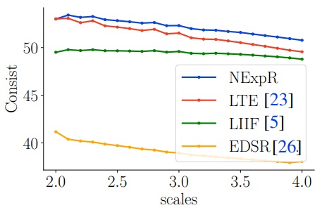
For example, in the following figure, the references “[23], [5], [26]” are added to the figure via \put command:

The reference numbers in the figure are clickable and will take you to the corresponding reference when clicked. The corresponding LaTeX code is:
 \begin{figure}[!htb]
        \centering
        \begin{overpic}{example.pdf}
            \put(9, 7.5){\ref{reference-1}} % put references
            \put(42, 7.5){\ref{reference-2}}
            \put(75, 7.5){\ref{reference-3}}
        \end{overpic}
        \caption{
            Figure with text added in LaTeX by overpic.
        }
\end{figure}
Use LaTeX for Text Rendering in Matplotlib
Many people, especially in the Computer Science and AI community, use Python’s matplotlib for figures and plots. Those plots often contain text elements, such as axis ticks and labels. However, matplotlib’s default font style differs from that of LaTeX.
We can use TeX as the text rendering engine and set font style to Computer Modern, which is the default font style in LaTeX.
It’s pretty easy: just add the following code snippet before creating figures:
import matplotlib.pyplot as plt
plt.rcParams.update({
    "text.usetex": True,
    "font.family": "Computer Modern"
})
Tip: This requires having a valid TeX installation, such as texlive, on your system.
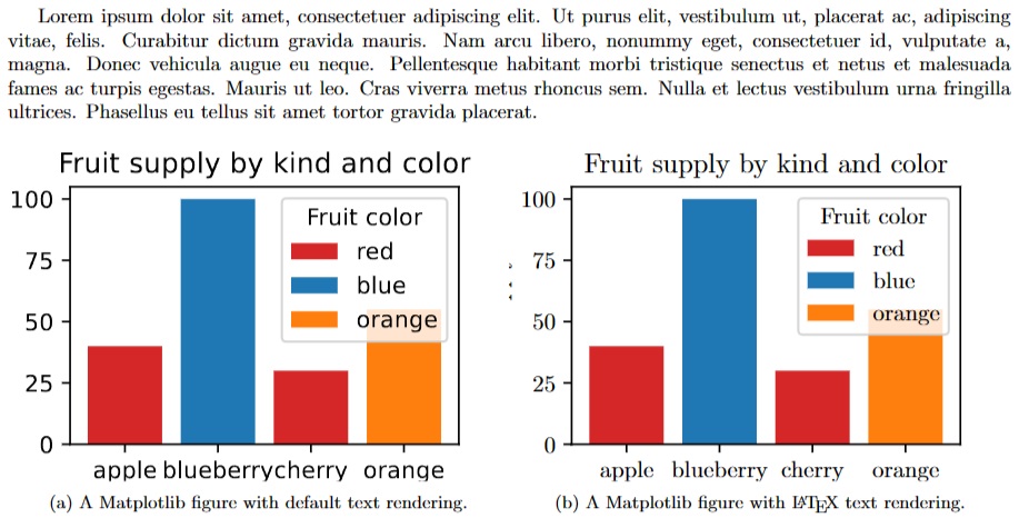
The below figure demonstrates text rendered by Matplotlib default engine and TeX. Apparently, the TeX rendered text is more consistent with the main document.

Colors
Colors are important visual elements. Choosing proper colors would make your figures more good-looking and professional. When choosing colors for figures in academic papers, it’s important to prioritize clarity, professionalism, and accessibility. Here are some guidelines:
High Contrast
Use colors with high contrast to ensure that data points and lines are easily distinguishable.
Cool Colors
Cool colors (blues and greens) are often preferred in academic papers for their calm and professional appearance. Color (Hex: #557C55), Color (Hex: #872341), Color (Hex: #2B3499)
Consistency
Use consistent colors in throughout the document. You may have more than one figures, e.g. curve, bar, and box plots, in your paper. Use consistent colors across figures.
Semantics
Use color with semantics. For example, use blue for accuracy and red for error. Another example is the following figure which illustrates the evolution of Gaussian kernels with varying sigmas. The Gaussian kernel is more concave with larger $\sigma$ and flatter with smaller $\sigma$.

The gradient-color is more intuitive in this case because the color clearly demonstrates the change in sigma and the evolution of Gaussian kernels. Below is the color-gradient I used in the figure.
Avoid Neon or Extremely Bright Colors
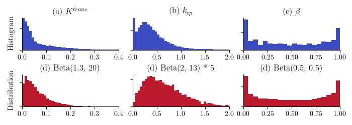
Neon or Extremely Bright Colors can be distracting and may not convey a serious tone. For example, in the figure below, colors of the right plot are more visually appealing and comfortable.

Where do I Get Good Colors?
If you are using Matplotlib, there are predefined named colors: List of named colors. You can select a color and reference it directly in your code using its name.
Additionally, you can explore the website Color Hunt, where you can find appealing colors and color combinations. Simply click on the bottom-left corner of each color bar to copy the corresponding color’s hex code.
This post has shared several tips with you regarding LaTeX figures. While figures are not the key to the success of your paper, but hopefully these tips might help in producing more professional documents and leave a positive first impression on the audience.